maggiealderson

Archive for January, 2014|Monthly archive page

Peter Pilotto for Target

In Designers, Shopping on January 15, 2014 at 11:23 am

Look-7.jpg target

Great excitement on opening my emails today – Peter Pilotto has done a range for Target. Woo hoo!

I’ve been obsessed with these clothes since I first saw their exquisite (and much imitated since…) digital prints in London Fashion Week reports five years ago – and I say ‘their’ because despite the singular name on the label, the clothes are designed by two men, the eponymous Mr Pilotto and Christopher De Vos.

Their biography gloriously encapsulates the global nature of modern high fashion: Pilotto is half-Austrian, half-Italian and De Vos is half-Belgian, half-Peruvian. The designers met whilst studying at Antwerp’s Royal Academy of Fine Arts in the year 2000. The label is based in London’s groovy East End.

PP_SS12_021PP_SS12_010PP_SS12_020PP_SS12_024

From my first glimpse of them Peter Pilotto clothes joined the rank of the elite ranges I sneak into Liberty and Dover Street Market to stroke and sigh over. (Lanvin is top of that list…). These pics are from his spring/summer 2012, which was a particular favourite.

I treat them like museum artefacts to be appreciated, admired and adored, but which I could never buy. The dresses are around £1000, skirts £500.

So I’m thrilled to see that they’ve done a collection for Target, which will go on sale on February 9th. If the quality of my Philip Lim for Target sweatshirt is a benchmark, these will be worth having. The Philip Lim for Target dress at the top of the post will sell for US$69.99. Sweet.

Look-14.jpg Target $49.99Look-171.jpg TargetLook-3.jpg TargetLook-9.jpg target

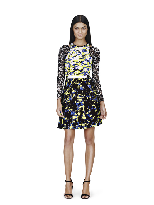
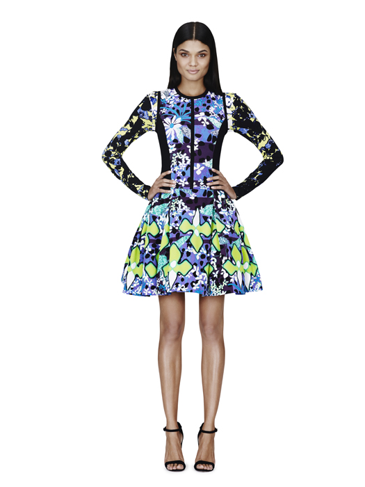
Here are some of my favourite items from the Target collection and  you can click on this link for the full look book, as it appeared on Fashionista.

http://fashionista.com/2014/01/peter-pilotto-target-lookbook/

Some of the shapes look tricky to wear the way they’re styled here, but I can see great potential in the simpler pieces (how could you go wrong with a pencil skirt in one of those prints?) and I simply adore the tote bags.

40770-A-020-640x426Of course, if you live outside the US getting hold of the gear will be more of a challenge. Target doesn’t even exist in the UK and the Aussie stores didn’t get the Philip Lim range – so it will be a matter of begging US-based pals to shop for you, or accepting, as I did last time, that you’ll have to pay a little over the odds on eBay.

Or you could plan a little Stateside shopping vacation ha ha ha, although I’d rather pay more and not have to endure the mob scenes these designer ranges create when they are dropped into chain stores. Ugly.

And just to show why you should care, take a look at the last Peter Pilotto show at London Fashion Week last year.

http://www.londonfashionweek.co.uk/designers_profile.aspx?DesignerID=395

Colour me beautiful

In Decorating, Home on January 6, 2014 at 10:28 pm

IMG_0204

There’s a spot of redecorating going on at Style Notes Towers, which means I’m getting to do one of my very favourite things – mess about with colour sample pots.

I have two paint colours to choose. The first one is fairly easy, it’s for the small room which used to be my daughter’s bedroom, but which has now metamorphosed into my boudoir/a spare room.

I’ve had a door put in leading from it into my walk-in wardrobe (which I wickedly created by stealing one third of the space of this room from my then infant daughter, when we moved into the house).

The wardrobe used to be accessible only from the other room – once the spare room, now my daughter’s new bigger bedroom. But as she’s nearly 12 and becoming increasingly interested in my shoes, it’s better she doesn’t have direct access to my closet, don’t you agree?

As the room I’m about to get painted is now a boudoir with my dressing table (and a single bed with a blue and white toile de jouy headboard), I want a very feminine feel, which will also reflect warm flattering light onto my ravaged old mug while I’m applying make up (with a trowel ha ha ha).

The colour I’m going for is Cheap Foundation. Not a real paint shade – although it should be – I mean I want the walls to look like make up. Something with this kind of warm feel, but not so true peach…

19

I’ve picked up sample pots of four possibilities and now I’m using a brilliant tip that a clever friend (with two DIVINE houses) once told me, which has become one of my decorating commandments:

Never paint your sample pot paint colours straight on to the wall.

 If you do this – and I’ve seen twelve different colours daubed onto one small patch of wall – all the colours interact with each other, making them look subtly different.

Your eyes will get jumbled and you simply won’t be able to get a clear impression of what the finished effect of each shade would be over the whole room.

IMG_0183

What that friend – Jane – advised me to do is to paint separate pieces of cartridge paper (at least A4 size) with each of your possible colours and then look at each of them, one at a time, masking taped to the wall.

Using this technique, you can also see how each colour looks on all the different walls of a room. A shade of grey that looks quite pastel opposite the window, can look grimly dark on the window wall itself.

And obvs you also need to look at your possible colours in daylight and whatever artificial lighting you will be using in the finished room.

Jane – a very practical Yorkshirewoman – also reminded me to write the brand and name/number of each colour on the back of the piece of cartridge paper in pencil, before you start painting it.

I’ve been doing this for years now and have built up a very handy library of painted sheets to refer to, so it’s worth keeping even the ones you don’t choose to use right away, as they may work for another project.

One more tip I would add, is to try and be more patient than me and let the pieces of painted paper really dry before you start leaping about with them… Slightly wet paint on soggy paper is quite a lot darker than the actual shade.

IMG_0195

Having done all this earlier today with my four pots I don’t think I’ve found the right colour yet. One of them is too similar to the corset pink I already have in the closet, one is too subtle, another veering towards deliberate apricot and even the one that’s closest doesn’t have the slightly ‘wrong’ feel I want. It needs just a little more brown in it.

IMG_0192


So I’ve ordered another couple of colours from the wonderful London paint shops Papers and Paints and when they arrive I’ll go through the process again. (I think the one right in the centre below, or top right above, could be the go…)

IMG_0206

When I do find the right one I’ll have it painted over the walls, skirting boards and the door into my closet – but I’ll leave the window and window sill white. I just don’t like the idea of the 12 panes of glass intersected by the orangey-browny-pinky colour. I think it would look odd.

I’m going to decide whether to paint the main door Maybelline Coral Concerto, or leave it white, once the rest of the room is painted. All of which is very pertinent to the other paint colour I need to choose – more of which next time…

Meanwhile, tell me – how do you choose paint colours?

Fragrant Cloud

I think in perfume

Style Notes

Style Notes

The Grooming Guru

An Expert's Guide To Midlife Male Grooming

Mad About The House

The sourcebook for modern living

WordPress.com

WordPress.com is the best place for your personal blog or business site.

by Hannah Rochell

slow comfortable style

North/South Food

Eating across the North/South divide

COOKING ON A BOOTSTRAP

by Jack Monroe, bestselling author of 'A Girl Called Jack'

Liberty London Girl

Just another WordPress.com site

The Selvedge Yard

A historical record of artistry, anarchy, alchemy & authenticity.

Cattle & Cane

Country Chronicles

WordPress.com News

The latest news on WordPress.com and the WordPress community.